In the competitive sphere of digital advertising, success often hinges on mastering the fundamentals. While powerful creative and persuasive copy are essential, one of the most vital yet frequently mismanaged elements is selecting the correct banner ads dimensions. The size and shape of your visual creative directly influence its visibility, click-through rate (CTR), and, most importantly, your campaign's return on investment (ROI).
Getting these specifications wrong is a costly mistake. An incorrectly sized ad can be awkwardly cropped, distorted by a publisher's ad slot, or rendered completely invisible on certain devices. This not only wastes your ad spend but also diminishes brand credibility. When users are already conditioned to ignore ads, a poorly formatted one has zero chance of breaking through the noise.
This comprehensive guide for 2026 eliminates the guesswork. We will provide a detailed breakdown of the top-performing and most common banner ads dimensions you need to know, covering everything from the Interactive Advertising Bureau (IAB) standards and Google Display Network sizes to crucial social media formats. You'll gain actionable insights into which sizes deliver the best performance for specific campaign goals. For any business, from a local Vancouver service company to a global e-commerce brand, mastering these technical requirements is the foundational step to ensuring your message is displayed perfectly, maximizing engagement, and driving meaningful conversions.
1. Leaderboard (728 × 90)
The Leaderboard is a cornerstone of digital advertising, one of the most established and widely recognised banner ads dimensions available. Its wide, narrow footprint (728 pixels wide by 90 pixels tall) is designed for horizontal placement, typically appearing "above the fold" at the very top of a webpage, though it's also effective at the bottom. This prime positioning ensures high visibility without significantly disrupting the user's content consumption, making it a powerful tool for brand awareness.
Popularized by the Google Display Network and major news publishers like The New York Times and CNN, its familiarity helps combat ad fatigue. For Juiced Digital’s clients, such as local Vancouver service providers or e-commerce brands, the Leaderboard offers sustained visibility on high-traffic publisher sites, making it an ideal choice for campaigns focused on building brand recall and authority.
When to Use the 728 × 90 Leaderboard
This format excels in specific scenarios:
- Brand Awareness Campaigns: Its prominent placement is perfect for getting your brand name, logo, and core message in front of a broad audience. A holistic health clinic in British Columbia, for instance, could use a Leaderboard on a local wellness blog to build community recognition.
- Top-of-Funnel Marketing: When the goal is to introduce your product or service, the Leaderboard effectively captures initial interest. An e-commerce brand can use it on lifestyle blogs to drive traffic to a new product category.
- High-Traffic Publisher Sites: Its standardisation means it's available on most major news, entertainment, and informational websites, allowing you to reach a massive, diverse audience.
Actionable Tips for High-Performing Leaderboards
To maximize the impact of this classic format, focus on clarity and a strong call-to-action (CTA).
Pro Tip: Due to its narrow height, messaging must be concise. A clear, benefit-driven headline is more effective than a cluttered design. Focus on a single, compelling value proposition.
- Combat Banner Blindness: Use bold, high-contrast colours for your CTA button to make it stand out.
- A/B Test Your Copy: Test different headlines for specific audiences. A message for a local service business ("Your Trusted Vancouver Plumber") will differ greatly from a national e-commerce brand ("Free Shipping Across Canada").
- Integrate Retargeting: Combine your Leaderboard campaign with retargeting to re-engage users who have previously visited your site, leading to significantly higher conversion rates. For a deeper dive into sizing and network specifications, you can explore this guide to Google Display Ad sizes and best practices.
2. Medium Rectangle (300 × 250)
The Medium Rectangle is arguably the most valuable and highest-performing of all banner ads dimensions. Its versatile, squarish aspect ratio (300 pixels wide by 250 pixels tall) provides ample creative space for compelling imagery, benefit-driven copy, and prominent calls-to-action. It integrates seamlessly within content, often appearing embedded in articles or in sidebars, which leads to higher engagement rates.
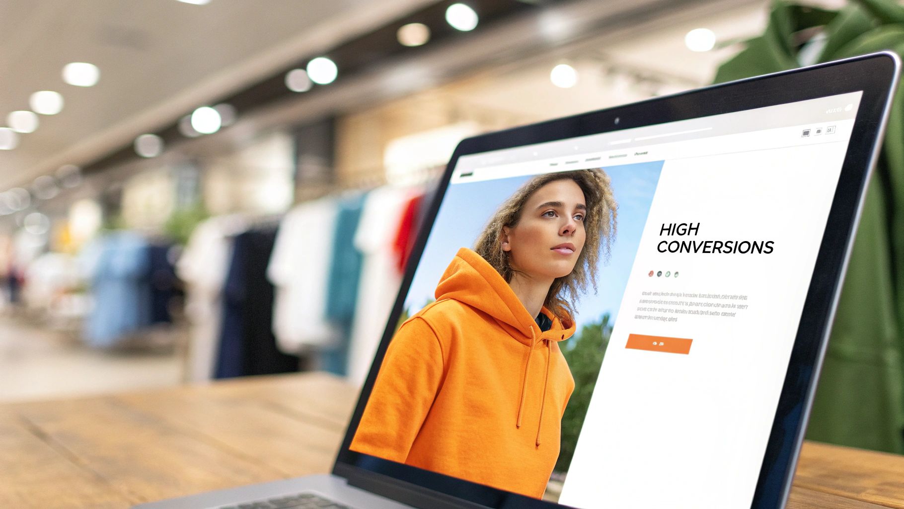
Popularized by the Google Display Network, where it is a top-recommended size, the Medium Rectangle is a workhorse for performance marketing. For Juiced Digital clients, from e-commerce brands showcasing new products to regulated industries like cannabis, this format consistently drives the highest conversion rates, making it a cornerstone of data-driven advertising strategies.
When to Use the 300 × 250 Medium Rectangle
This format is a powerhouse for direct-response campaigns:
- Conversion-Focused Campaigns: Its size allows for clear presentation of products or services, making it perfect for driving sales or leads. A local Vancouver service business can use it to promote a specific offer with a direct "Book Now" CTA.
- Mid-to-Low Funnel Marketing: Ideal for retargeting users who have shown interest. An e-commerce brand can display the exact product a user viewed, reminding them to complete their purchase.
- Regulated Industries: The space is sufficient for including necessary compliance messaging without sacrificing visual appeal, crucial for cannabis, CBD, or wellness clinics in British Columbia.
Actionable Tips for High-Performing Medium Rectangles
To unlock the full potential of this format, focus on a clear visual hierarchy and compelling creative.
Pro Tip: Use the ample space to your advantage. Unlike narrow banners, the 300 × 250 allows for a balanced composition of an image, a headline, a brief description, and a CTA button.
- Leverage High-Quality Imagery: Use crisp product photos or engaging lifestyle images. For a functional mushroom brand, this could be an image showing the product in a daily routine.
- Drive Urgency: Incorporate elements like countdown timers or "Limited Time Offer" text to encourage immediate action from users.
- Implement Strong Local Targeting: For local service businesses, pair this ad size with precise geographic targeting, such as specific postal codes or neighbourhoods in Vancouver, to maximize ROI. To learn more about building these campaigns, explore our approach to paid traffic from Google Ads PPC advertising.
3. Wide Skyscraper (160 × 600)
The Wide Skyscraper is a tall, narrow vertical banner that offers significant creative real estate down the side of a webpage. Measuring 160 pixels wide by 600 pixels tall, this format is one of the most impactful banner ads dimensions for storytelling and brand visibility. Typically placed in sidebars, it remains in the user's peripheral vision as they scroll, providing sustained exposure.
Popularized by major publishing networks and content-heavy sites like health and wellness blogs, the Wide Skyscraper is a powerful tool for engagement. For Juiced Digital’s clients, such as holistic health clinics or e-commerce brands, this format allows for more complex messaging, making it ideal for educating audiences and building authority within niche markets.
When to Use the 160 × 600 Wide Skyscraper
This vertical format is particularly effective in specific contexts:
- Educational Campaigns: Its height is perfect for presenting sequential information. A functional mushroom brand could use it to detail the benefits of different supplements, guiding users through a logical flow.
- Brand Storytelling: The extended canvas allows for more immersive creative. An e-commerce health brand can use lifestyle imagery to tell a compelling story that connects emotionally with its audience.
- Showcasing Multiple Offerings: A local wellness practitioner can list several services, from nutrition counselling to personal training, within a single, cohesive ad unit, maximizing the value of each impression.
Actionable Tips for High-Performing Wide Skyscapers
To leverage the height of this format, think vertically and guide the user's eye downward with a clear narrative.
Pro Tip: Use the vertical space to create a mini-infographic or a step-by-step guide. A cannabis dispensary, for example, could use animated sequences to showcase different product categories, from edibles to topicals, leading to a final CTA.
- Implement Sequential Messaging: Structure your ad with a clear problem, solution, and call-to-action (CTA) from top to bottom. This logical flow maximizes engagement and comprehension.
- Leverage Animation: Use subtle, animated sequences to tell a complete brand story or draw attention to key benefits without overwhelming the user.
- Ensure Visual Contrast: As this ad sits alongside primary content, use bold colours and high-contrast design to ensure it stands out and captures user attention effectively.
4. Half Page / Large Rectangle (300 × 600)
The Half Page is a dominant force among banner ads dimensions, commanding significant attention with its large, vertical format (300 pixels wide by 600 pixels tall). Often referred to as a "Large Rectangle," its substantial real estate offers unparalleled creative freedom, making it one of the most visually impactful placements available. This premium ad unit typically appears alongside content, providing a persistent and immersive brand experience without interrupting the user's journey.
Popularized by premium publisher networks and high-end e-commerce brands, its size makes it a high-performing choice for campaigns focused on conversions and deep engagement. For Juiced Digital’s clients, such as cannabis retailers in Canada or holistic health clinics, the Half Page allows for rich storytelling and detailed service showcases, establishing authority and driving high-quality leads.
When to Use the 300 × 600 Half Page
This format is best deployed for high-impact objectives:
- High-Converting Campaigns: Its size is ideal for showcasing product details, customer testimonials, or compelling offers. An e-commerce brand launching a new collection can use it to display high-resolution product imagery and drive direct sales.
- Immersive Brand Storytelling: The large canvas is perfect for brands wanting to communicate a deeper message. A functional mushroom company could use an animated Half Page ad to illustrate the benefits of its products in a visually engaging way.
- Targeting High-Intent Audiences: Given its higher CPM, this format is best reserved for premium publisher sites and retargeting campaigns where the audience has already shown interest. A Vancouver real estate agent could use it on a local luxury lifestyle blog to target affluent homebuyers.
Actionable Tips for High-Performing Half Pages
To justify the premium cost of this ad unit, creative excellence and strategic implementation are crucial.
Pro Tip: Use the vertical space to tell a story or guide the user's eye downwards towards a clear call-to-action. Layering elements like a headline, body copy, product image, and a CTA button creates a natural flow.
- Leverage Rich Media: Incorporate video or subtle animations to capture attention and increase engagement. This justifies the higher cost and helps your ad stand out.
- Combine with AI-Powered Bidding: Use automated bidding strategies like Target CPA or Maximize Conversions to ensure your investment is delivering a positive ROI, especially on higher-cost placements.
- A/B Test Creative Heavily: The large canvas offers many creative possibilities. Continuously test different visuals, headlines, and CTA designs to optimize your conversion rate and find the most effective message for your audience.
5. Vertical Rectangle / Portrait (300 × 1050)
The Vertical Rectangle, also known as the Portrait, is a commanding ad unit designed for maximum vertical impact. At 300 pixels wide by 1050 pixels tall, this format takes up significant screen real estate alongside scrollable content, making it one of the more premium banner ads dimensions. Its impressive height offers a large canvas for storytelling, perfect for brands that need to convey detailed information or showcase multiple product features in a single view.
This format is gaining traction among premium health and wellness publishers, particularly those with long-form articles. For Juiced Digital's clients in regulated industries like cannabis, CBD, or functional mushrooms, the Portrait ad is invaluable. It provides the space needed to communicate product benefits, usage instructions, and critical compliance information without feeling cramped, building trust and authority with discerning consumers.
When to Use the 300 × 1050 Vertical Rectangle
This format is highly specialized and excels in specific contexts:
- Educational Campaigns: Its tall structure is ideal for step-by-step guides or explaining complex topics. A functional mushroom brand, for instance, could use it on a wellness blog to detail the unique benefits of different mushroom types.
- Brand Storytelling: When a simple message isn’t enough, this ad allows for a narrative approach. A holistic health practitioner in British Columbia could showcase multiple services, client testimonials, and their unique philosophy in one cohesive creative.
- Regulated Product Marketing: For cannabis or CBD companies, this format provides ample room for mandatory disclaimers, lab results, and educational content, ensuring compliance while marketing effectively.
- Premium Placements: This ad is typically found on niche, high-quality publisher sites, making it suitable for reaching dedicated audiences on long-form content pages.
Actionable Tips for High-Performing Vertical Rectangles
To leverage this ad’s large canvas, focus on structured storytelling and visual flow.
Pro Tip: Divide the ad's vertical space into logical, scannable sections. Use distinct visual breaks or subheadings to guide the user’s eye downwards, treating the ad like a mini-landing page.
- Prioritize Visual Hierarchy: Place your most compelling message or offer at the top, as users will see it first. Use the remaining space for supporting details and trust signals.
- Incorporate Trust Signals: Use the ample space to display certifications, awards, or customer testimonials throughout the creative to build credibility.
- Guide the Eye with Animation: Use subtle, non-intrusive animations to draw attention down the ad, ensuring the full message is seen.
- Keep a Persistent CTA: Ensure your call-to-action is visible at both the top and bottom of the ad, or have it "stick" as the user scrolls, to maximize conversion opportunities.
6. Mobile Banner (320 × 50)
The Mobile Banner is the essential, compact ad format designed specifically for the smartphone era. Its dimensions (320 pixels wide by 50 pixels tall) are tailored for the smaller screens of mobile devices, typically appearing as a persistent "sticky" banner at the top or bottom of an app or mobile website. With mobile traffic now dominating the digital landscape, this format is indispensable for reaching users where they spend a significant portion of their time.
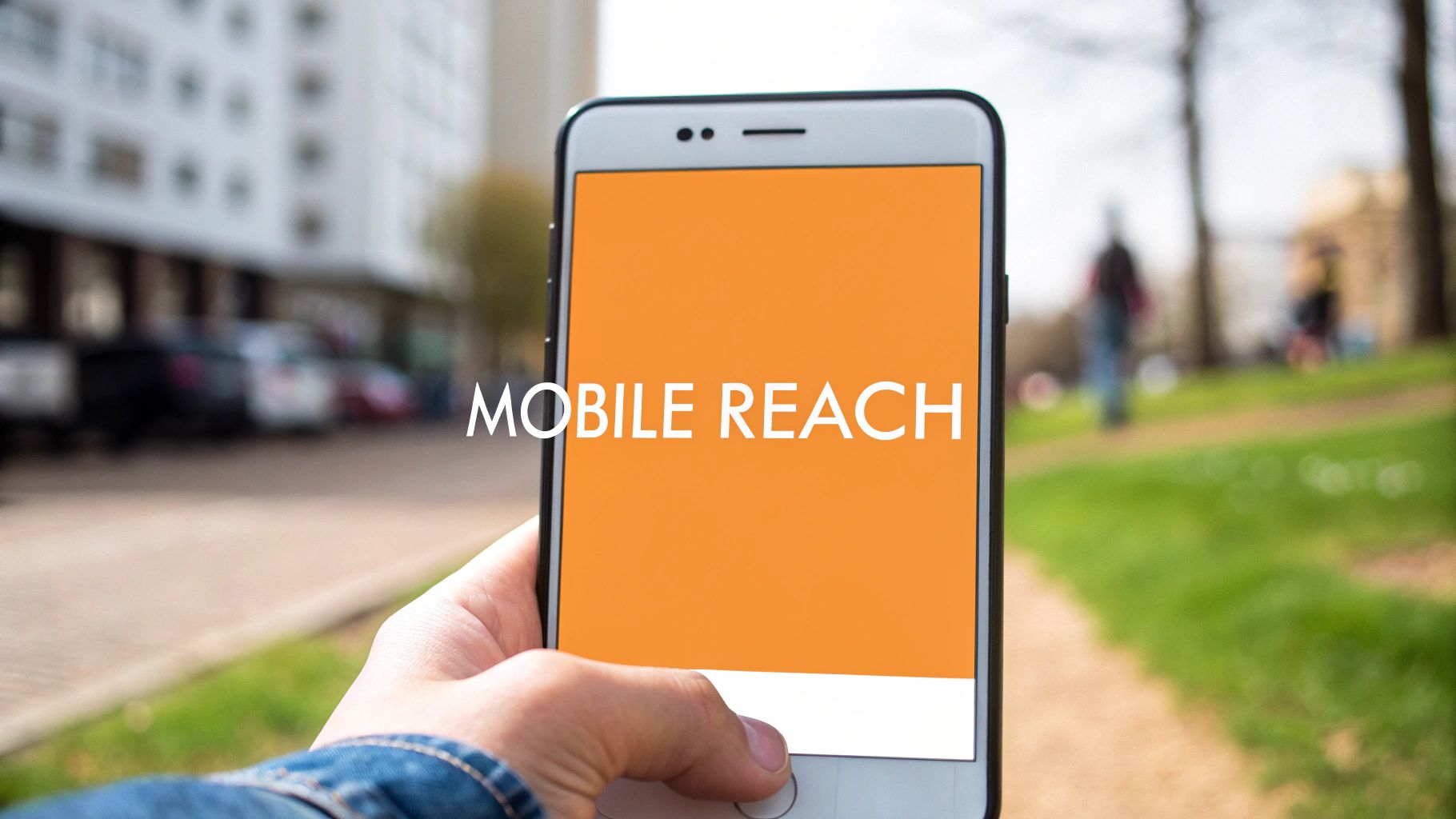
Popularized by the Google Mobile Ads network and the explosion of app-based ecosystems, its unobtrusive nature makes it a favourite for monetization without severely impacting the user experience. For Juiced Digital’s clients, from Vancouver service businesses targeting local searchers to e-commerce brands driving in-app sales, mastering these banner ads dimensions is crucial for capturing the on-the-go consumer.
When to Use the 320 × 50 Mobile Banner
This mobile-first format is most effective in specific contexts:
- Local Service Lead Generation: Its presence on mobile search results and local apps is perfect for capturing high-intent users. A plumber in Vancouver can use this ad to get immediate calls from residents searching for "emergency plumbing services near me."
- In-App Promotions: E-commerce and wellness apps can leverage the Mobile Banner to announce flash sales, new features, or appointment openings directly to their active user base.
- Continuous Brand Presence: For brands wanting to maintain top-of-mind awareness, the Mobile Banner provides a constant, subtle reminder of their value proposition as users browse content on their phones.
Actionable Tips for High-Performing Mobile Banners
To maximize conversions from this small but mighty format, your design and message must be incredibly focused.
Pro Tip: With only 50 pixels of height, text must be minimal. A 3-4 word, benefit-driven headline combined with a clear logo is far more effective than trying to cram in too much information. Think "tap-friendly," not text-heavy.
- Prioritise a Clear CTA: Use a high-contrast button that is large enough to be easily tapped with a thumb. Test phrases like "Tap to Call" for services or "Shop Now" for e-commerce.
- Place for User Experience: Placing the banner at the bottom of the screen often feels less intrusive to users navigating a site or app from the top down.
- Leverage Mobile-Specific Retargeting: Serve these ads to users who have previously visited your website on their mobile device. This keeps your brand visible and encourages them to complete their action, whether it's booking a consultation or finishing a purchase.
7. Large Mobile Banner (320 × 100)
The Large Mobile Banner is an upgraded version of its smaller counterpart, offering double the vertical space. This expansion from 50 to 100 pixels in height provides significantly more creative real estate while remaining one of the most common mobile banner ads dimensions. This format is designed to deliver a richer visual experience on smartphones without becoming overly intrusive, making it a powerful choice for advertisers who need more than a simple text line.
Popularized through the evolution of mobile-first advertising and app publisher networks, its enhanced canvas allows for better messaging and visual impact. For Juiced Digital's e-commerce clients, such as functional mushroom brands or holistic health clinics, the 320 × 100 format can showcase product imagery and a compelling offer, capturing user attention more effectively on mobile devices where screen space is at a premium.
When to Use the 320 × 100 Large Mobile Banner
This mobile-specific format is ideal for campaigns targeting on-the-go audiences:
- Visually Driven E-commerce: The extra height is perfect for displaying high-quality product images alongside a brief description and price. An e-commerce brand selling artisanal goods can use this space to make its products pop.
- Local Service Promotions: For businesses like a Vancouver-based clinic or a cannabis delivery service, this format can include a prominent click-to-call or "Book Now" button, directly driving high-intent actions from mobile users.
- App Install Campaigns: The larger space allows for more engaging visuals and a clearer call-to-action to download an app, leading to higher conversion rates compared to the smaller 320 × 50 banner.
Actionable Tips for High-Performing Large Mobile Banners
To leverage the extra space effectively, focus on visual clarity and a direct path to conversion.
Pro Tip: Use the increased height to make your core value proposition and call-to-action (CTA) impossible to miss. Prioritize a single, high-quality image of your product or service in action.
- Optimize for Thumb Reach: Place your most important elements, especially the CTA button, in an easily tappable zone. Consider how users naturally hold their phones.
- Keep Copy Scannable: Even with more space, mobile users scan quickly. Stick to a concise headline of 8–12 words that clearly communicates your offer.
- A/B Test Against the 320 × 50: Run controlled tests to determine which mobile banner format delivers the best performance for your specific campaign goals and audience, as performance can vary by publisher and context.
8. Sidebar Rectangle (120 × 600)
The Sidebar Rectangle, often called a "Skyscraper," is a classic vertical format designed for the narrow side margins of desktop websites. Its tall, slender profile (120 pixels wide by 600 pixels tall) allows it to maintain a consistent brand presence alongside primary content without being intrusive. This ad unit is one of the original banner ads dimensions, popularized by early, sidebar-heavy website layouts and content publisher networks.
For Juiced Digital's clients in specialized industries, like holistic health practitioners or cannabis education portals, this format provides a subtle yet effective way to stay visible. It fits neatly into niche, high-intent publisher sites where audiences are already engaged with related content, making it a valuable tool for supplementary brand awareness and reinforcing authority.
When to Use the 120 × 600 Sidebar Rectangle
This vertical format is particularly effective for specific strategic goals:
- Niche Audience Targeting: Ideal for placing on highly specific, content-rich blogs and forums. A functional mushroom brand could use this ad on a mycology education blog to reach a dedicated, knowledgeable audience.
- Sustained Brand Presence: When you want your brand to remain visible as a user scrolls through an article, the Skyscraper keeps your logo and message in their peripheral vision.
- Content Marketing Synergy: It works exceptionally well when paired with sponsored articles or native content, acting as a constant reminder of the brand sponsoring the information.
Actionable Tips for High-Performing Sidebar Rectangles
To get the most out of this compact vertical space, you need a smart, stacked design approach.
Pro Tip: Leverage the vertical layout to tell a micro-story or guide the user's eye downward. Use animated sequences to reveal a message, showcase different product features, or lead to a clear call-to-action at the bottom.
- Stack Your Messaging: Design with a clear visual hierarchy. Place your logo at the top, a compelling headline in the middle, and a distinct CTA button at the bottom.
- Focus on High-Intent Networks: Deploy this ad size on niche publisher networks where it won't be overshadowed. Think local service directories for a Vancouver-based home service company or wellness practitioner networks for a B.C. clinic.
- Use as a Supplementary Format: The 120 × 600 is often best used in conjunction with more prominent ad sizes like the Leaderboard or MPU in a broader campaign to maximize reach and frequency.
9. Square (250 × 250)
The Square format is a compact and versatile member of the banner ads dimensions family, prized for its balanced and adaptable shape. Its 250 by 250-pixel footprint integrates seamlessly into various layouts, particularly content feeds, sidebars, and grid-based designs. This format has gained significant traction with the rise of social media and native advertising, where it fits naturally alongside organic content.
Popularized by platforms like Instagram and Pinterest, its neat, tile-like appearance is less intrusive than traditional banner formats. For Juiced Digital’s clients, the Square ad is highly effective for showcasing specific products or services. A Vancouver-based cannabis retailer can use it to highlight a featured strain in a product feed, while a holistic health clinic might promote a specific service like acupuncture within a wellness blog’s sidebar.
When to Use the 250 × 250 Square
This format is particularly effective in visually driven contexts:
- Social Media and Native Advertising: Its native feel is perfect for campaigns on platforms where user-generated content is square, helping your ad blend in and feel less disruptive.
- E-commerce Product Showcases: The balanced dimensions are ideal for displaying a single product with a clear image, title, and price, making it a powerful tool for retargeting and direct-response campaigns.
- Mobile-First Campaigns: On smaller screens, the Square format occupies space efficiently without overwhelming the user, making it a solid choice for mobile web and in-app placements.
Actionable Tips for High-Performing Squares
To make this compact format work hard, your design must be visually compelling and focused.
Pro Tip: With limited space, your image is the hero. Use high-quality, high-contrast product photography or iconography that grabs attention instantly within a fast-scrolling feed.
- Keep Copy Minimal: Stick to a powerful headline and a very brief line of copy. The visual element should do most of the talking.
- Emphasize a Strong CTA: A clear, concise call-to-action button is crucial. Use a colour that contrasts with the background to guide the user's eye and drive clicks.
- Test Across Placements: While excellent for social feeds, test the Square ad in different placements like website sidebars or at the end of articles to discover where it resonates most with your audience. A functional mushroom brand, for example, might find it performs best on lifestyle blogs.
10. Full Banner (468 × 60)
The Full Banner is one of the original banner ads dimensions, a classic format that predates many of the larger sizes common today. Its 468 pixels wide by 60 pixels tall footprint offers a compact horizontal ad unit, often found within the content of a webpage or above forum signatures. Though less dominant than the larger Leaderboard, it remains a viable option on many legacy websites and specific publisher networks.
Popularized by early web advertising standards and traditional display networks, the Full Banner is a familiar sight. For Juiced Digital’s clients, like holistic health practitioners advertising on niche directory sites or local Vancouver service businesses featured on community forums, this format can be a cost-effective choice for targeted visibility where larger ad inventory is limited.
When to Use the 468 × 60 Full Banner
This specific format is most effective in particular contexts:
- Niche and Legacy Websites: It is often available on older or specialized websites, like forums, directories, and community portals, where modern ad sizes may not be supported. This allows brands to reach highly targeted, dedicated audiences.
- Budget-Conscious Campaigns: Full Banner inventory can sometimes be more affordable than premium Leaderboard placements, offering a good entry point for brand awareness on a smaller budget.
- Supplementing Campaign Reach: When primary banner ad sizes have limited availability on a target publisher, the Full Banner serves as an excellent alternative to ensure comprehensive ad coverage and maintain brand presence.
Actionable Tips for High-Performing Full Banners
To get the most out of this compact ad unit, your design and messaging must be exceptionally clear and direct.
Pro Tip: With only 60 pixels of height, there is no room for clutter. Your value proposition must be communicated instantly with a clear headline, minimal text, and a strong visual anchor.
- Prioritise a Strong CTA: Use a high-contrast button with a concise, action-oriented command like "Learn More" or "Get Quote" to guide the user's next step.
- Test Against the Leaderboard: If a publisher offers both the Full Banner and the Leaderboard, run an A/B test to see which format delivers a better click-through rate and cost-per-acquisition for your specific campaign.
- Focus on Visuals: Use compelling, simple imagery or bold typography to capture attention and combat banner blindness. For insights on improving ad performance, explore our guide to conversion rate optimizations.
Top 10 Banner Ad Dimensions Comparison
| Format | 🔄 Complexity (implementation) | 💡 Resources (creative / cost) | ⚡ Efficiency & Reach (speed / inventory) | 📊 Expected outcomes & Ideal use cases (quality ⭐) |
|---|---|---|---|---|
| Leaderboard (728 × 90) | Low — simple horizontal creative; easy deploy | Low — basic image/animated assets; CPM $2–$5 | High impressions on desktop/tablet; wide inventory | Brand awareness, local services, budget campaigns; moderate conversions. ⭐⭐ |
| Medium Rectangle (300 × 250) | Medium — richer creative/animation support | Medium — higher-quality assets/video possible; CPM $4–$8 | Very high inventory; cross-device support; strong ad visibility | High CTR and conversions; e‑commerce, retargeting, regulated industries. ⭐⭐⭐ |
| Wide Skyscraper (160 × 600) | Medium — vertical creative & sequencing needed | Medium — vertical assets/animations; CPM $5–$10 | Good scroll visibility on sidebars; lower inventory than 300×250 | Brand storytelling, wellness/health niches; sustained engagement. ⭐⭐ |
| Half Page / Large Rectangle (300 × 600) | High — large, interactive or video creative | High — premium creative + production; CPM $8–$15 | Lower inventory but high impact on desktop; premium placements | Premium campaigns, high-intent conversions, strong brand recall. ⭐⭐⭐ |
| Vertical Rectangle / Portrait (300 × 1050) | High — custom long-form creative & design expertise | Very high — specialized assets; CPM $10–$20 | Very limited inventory; excels on long-form pages | Educational/compliance messaging, authority building for regulated sectors. ⭐⭐⭐ |
| Mobile Banner (320 × 50) | Low — compact mobile creative, simple build | Low — small assets; CPM $1–$3 | Essential mobile reach; very high inventory in apps; lower CTR | Mobile-first audiences, local service reach, high frequency brand touchpoints. ⭐⭐ |
| Large Mobile Banner (320 × 100) | Low–Medium — larger mobile layout, thumb-optimized | Low–Medium — improved mobile assets; CPM $2–$4 | Better readability/CTR than 320×50; moderate inventory | Mobile e‑commerce, click-to-call leads, app promotions. ⭐⭐ |
| Sidebar Rectangle (120 × 600) | Low — narrow vertical creative | Low — simple vertical assets; CPM $2–$4 | Niche sidebar inventory; lower impressions | Supplementary brand awareness in niche publisher networks; budget campaigns. ⭐⭐ |
| Square (250 × 250) | Low–Medium — adaptable across feeds | Medium — social/native-optimized creative; CPM $3–$6 | Versatile across desktop, mobile, and social feeds; good inventory | Social media and feed placements, product showcases; balanced performance. ⭐⭐ |
| Full Banner (468 × 60) | Low — traditional horizontal format | Low — moderate creative; CPM $2–$5 | Legacy placements; declining but available inventory | Transitional brand awareness on select publishers; alternative to leaderboard. ⭐⭐ |
From Pixels to Profit: Turning Dimensions into Data-Driven Decisions
Navigating the landscape of banner ads dimensions can feel like learning a new language, one spoken in pixels and aspect ratios. Throughout this guide, we've deciphered the grammar of digital advertising, moving from the foundational IAB standards to the dynamic requirements of Google, Facebook, and other major networks. We've explored the most common sizes, their strategic applications, and the technical specifications that underpin every successful campaign.
The journey from a blank canvas to a high-performing ad unit is paved with precise technical choices. We’ve seen how top-performing formats like the Medium Rectangle (300 × 250) and the Mobile Banner (320 × 50) have become ubiquitous for their versatility and high inventory. Yet, we've also uncovered the strategic power of less common but highly impactful sizes like the Half Page (300 × 600), which offers a massive canvas for compelling brand storytelling. Understanding these nuances is the first step toward transforming your ad spend from a simple expenditure into a strategic investment.
Key Takeaways: Beyond the Pixel Count
Mastering banner ad dimensions isn't just about memorising numbers. It's about internalising a strategic framework. Here are the core principles to carry forward:
- Context is King: The most effective ad size is always the one that best fits the user's environment. A Wide Skyscraper (160 × 600) integrates seamlessly into a blog's sidebar, while a Leaderboard (728 × 90) commands attention at the top of a forum. Always analyse the placement before finalising your creative.
- Mobile-First is Non-Negotiable: With the majority of web traffic originating from mobile devices, formats like the Large Mobile Banner (320 × 100) are no longer an afterthought. Design your campaigns with the mobile experience as the priority, ensuring your message is clear and your CTA is tappable on smaller screens.
- Responsive is the New Standard: Relying on a single static size is a relic of the past. Google's Responsive Display Ads (RDAs) are a testament to the industry's shift toward automation and flexibility. By providing a set of assets, you empower algorithms to find the optimal combination of size, headline, and image for each ad slot, dramatically increasing your reach and efficiency.
- Technical Specs are the Foundation: Beyond the dimensions, factors like file format (JPG, PNG, GIF, HTML5), file size limits (typically under 150 KB), and resolution (designing at 2x for Retina displays) are critical. Ignoring these technical guardrails can lead to rejected ads, poor load times, and a wasted budget.
Your Actionable Blueprint for Success
Armed with this comprehensive knowledge of banner ads dimensions, your next steps should be clear and deliberate. Don't let this information remain theoretical. It's time to put it into practice and start refining your advertising efforts for maximum impact.
Begin by auditing your current campaigns. Are you relying too heavily on just one or two ad sizes? Is your creative optimised for the most impactful placements? Use the insights from this article to identify opportunities for expansion and testing. Set up A/B tests comparing a Medium Rectangle against a Half Page unit to see which drives a higher conversion rate for your specific offer.
Next, streamline your creative production workflow. Create a set of master templates for the top five to seven ad sizes relevant to your industry. This simple step will save countless hours and ensure brand consistency across all your campaigns. Furthermore, embrace the power of responsive ads by preparing a library of high-quality images, logos, and compelling copy that can be mixed and matched algorithmically.
Ultimately, understanding banner ads dimensions is about gaining control over your campaign's performance. It’s the critical link between your creative vision and your financial results. By treating each size as a unique tool with its own strengths and applications, you move from simply running ads to architecting a sophisticated, data-driven marketing machine that consistently delivers measurable returns.
Ready to stop guessing and start optimising? Mastering the nuances of banner ads dimensions is crucial, but it's only one piece of the puzzle. At Juiced Digital, we leverage AI-powered paid media strategies to automate the testing, placement, and optimisation process, ensuring your ads are always delivered in the most effective format to the right audience. Let us turn your creative assets into a high-performance revenue engine.
